Talk soon.
Orum is an AI-powered platform with a suite of tools to supercharge sales team performance. With 170 employees and $50m in Series B funding, Orum wanted a complete rebrand that would reflect the company’s technological superiority and premium positioning.
Opportunity calls.
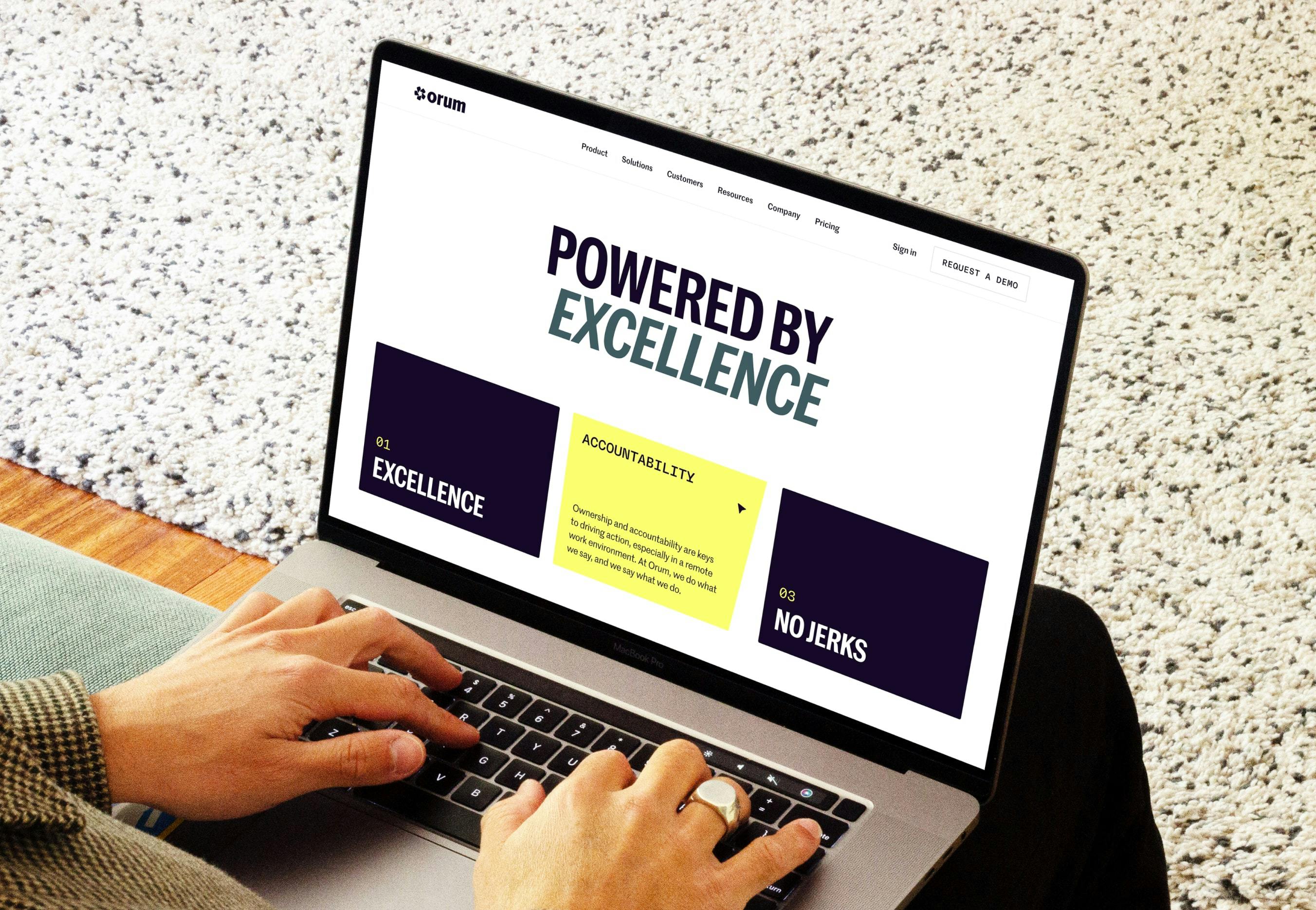
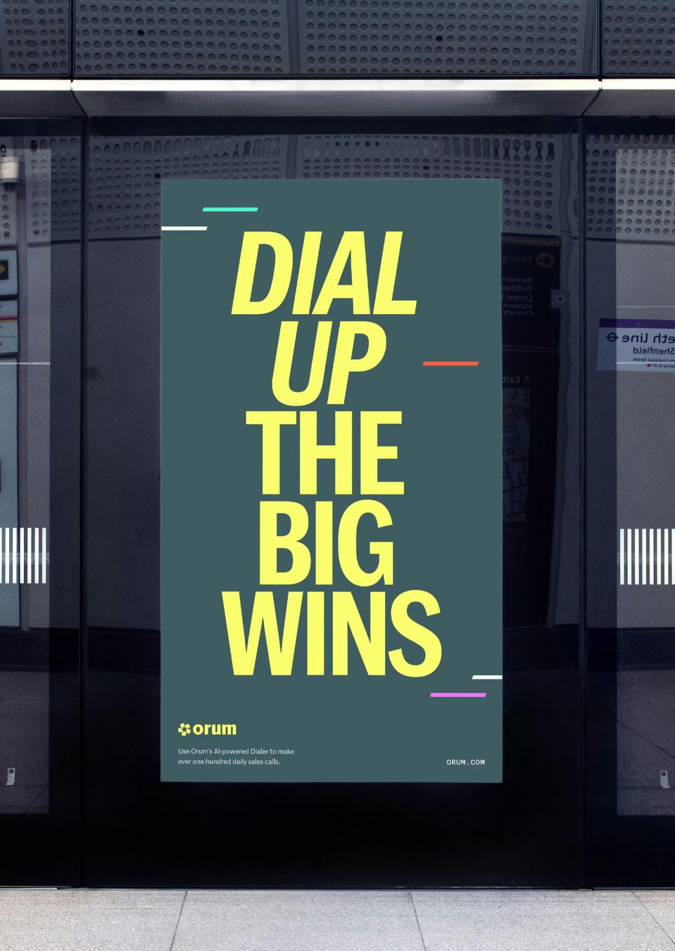
Working in sales is tough, like running a marathon or coming up with a good metaphor. Orum wanted to be to salespeople what Nike is to runners: The brand that’s on their side, empowers them, and helps them just do it. This idea of framing sales as a competitive sport became the key strategic concept for the brand, positioning Orum as a force multiplier giving sales teams an almost unfair advantage.
“Together just gets it. Your team understood exactly what we were doing, where we’re going, and what we needed to get there.”

Parker Tinsley
Product Marketing Manager, Orum
Always be closing.
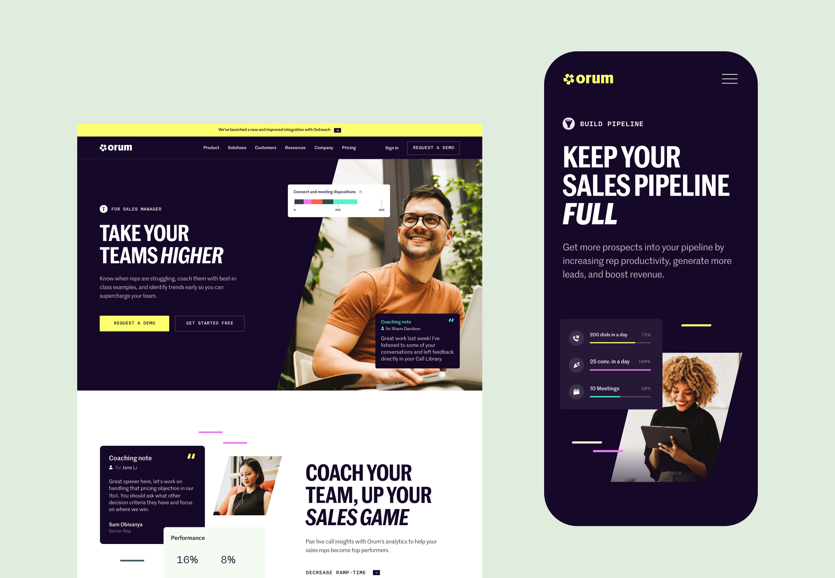
The idea of performance as the brand’s central concept came naturally. The link between sports and sales is strong, with similar attitudes to camaraderie, competitiveness and winning. Taking visual cues associated with data, performance metrics and progression, we wanted to establish a visual identity that would capture the essence of amplification and shared success.
Typography. A condensed, all-caps grotesque sans is the perfect medium for Orum’s sharp, confident headings, with italics for emphasis. Additional tech vibe courtesy of Marr Sans for body copy and Rational Neue Mono for stats.
Colours. Orum is Latin for gold, so a vibrant yellow seemed fitting, with a complementary Midnight Navy and Sage Grey as the brand’s primary colours. Secondary colours with complementary pastels and dark tones add depth.
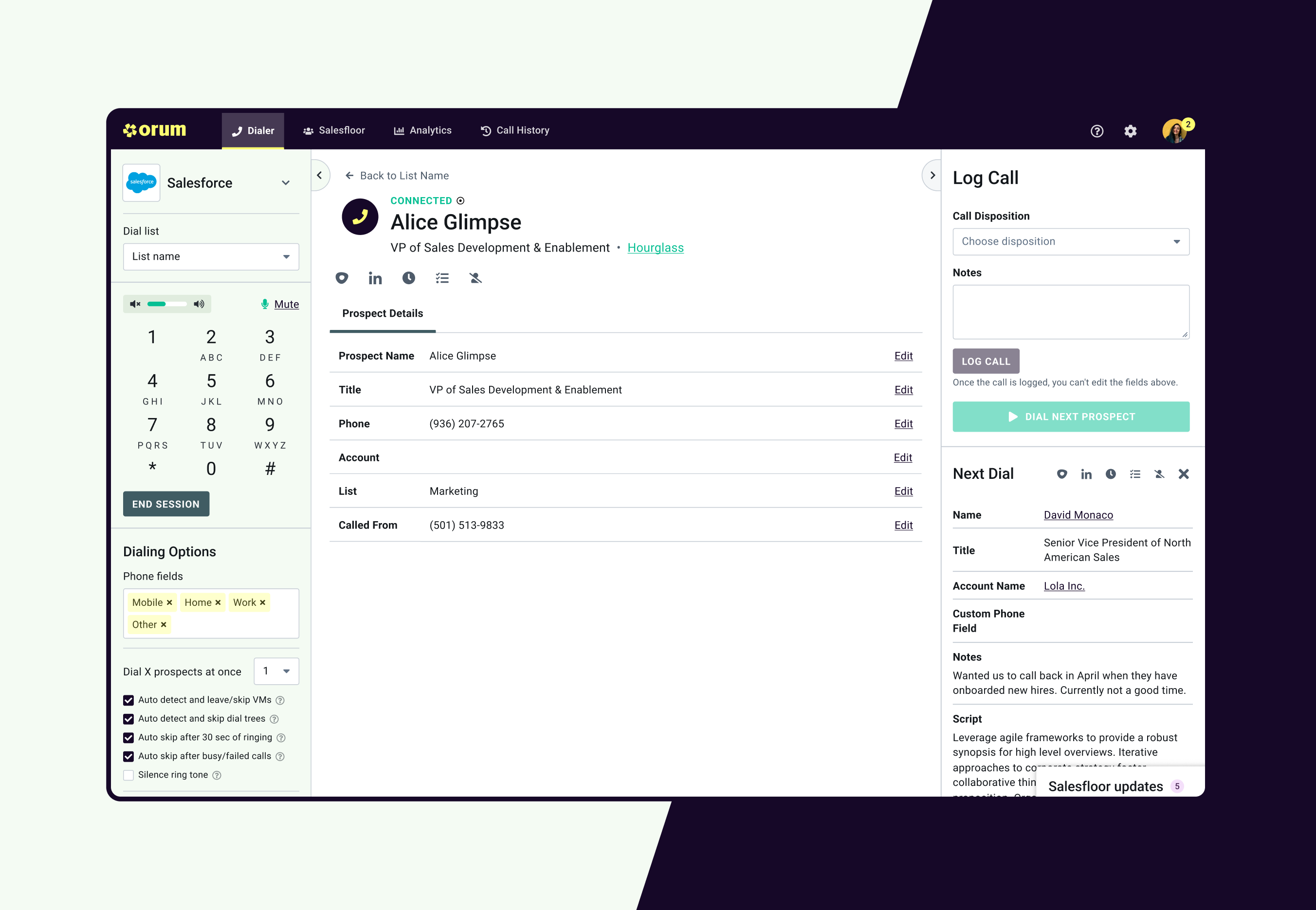
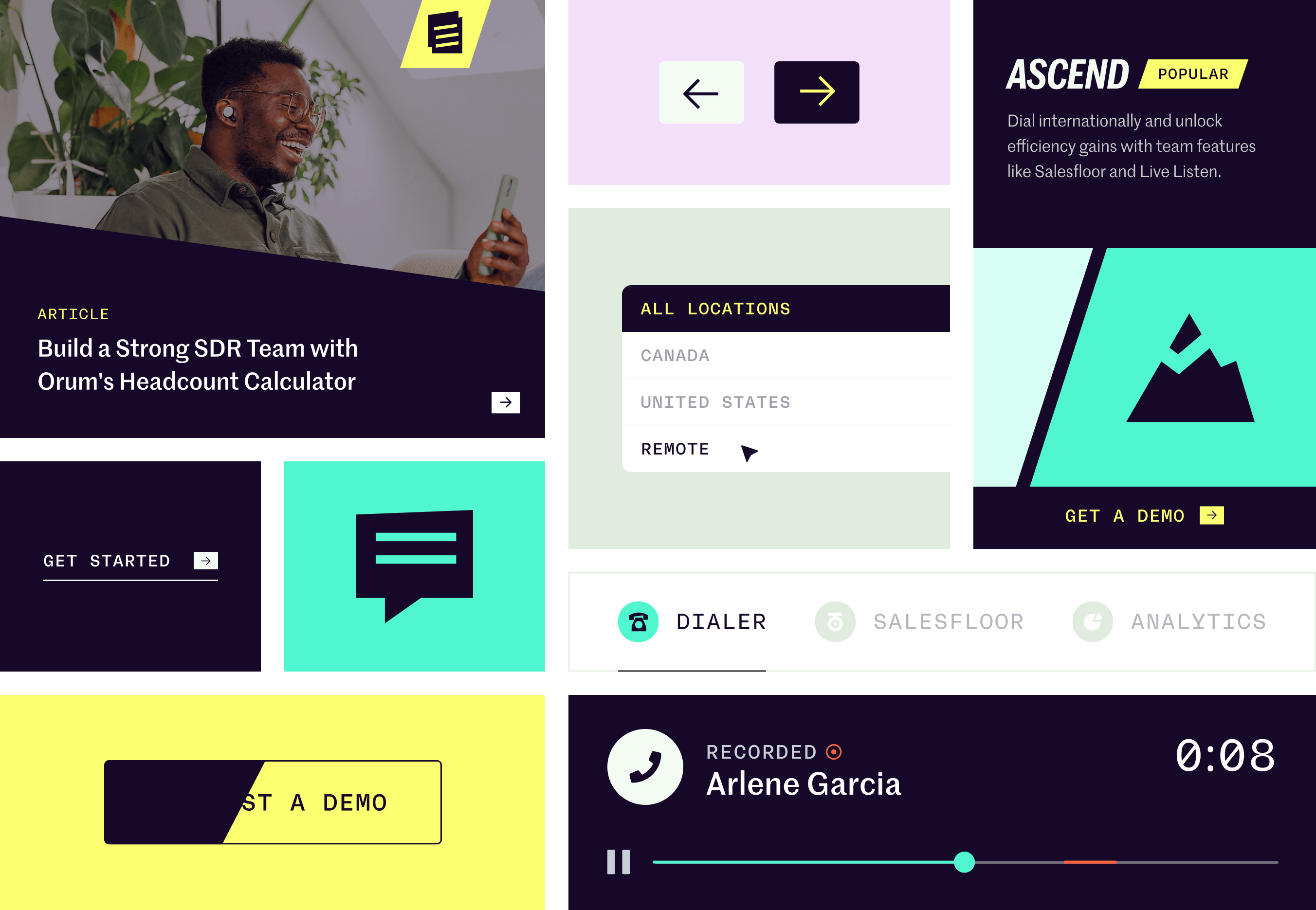
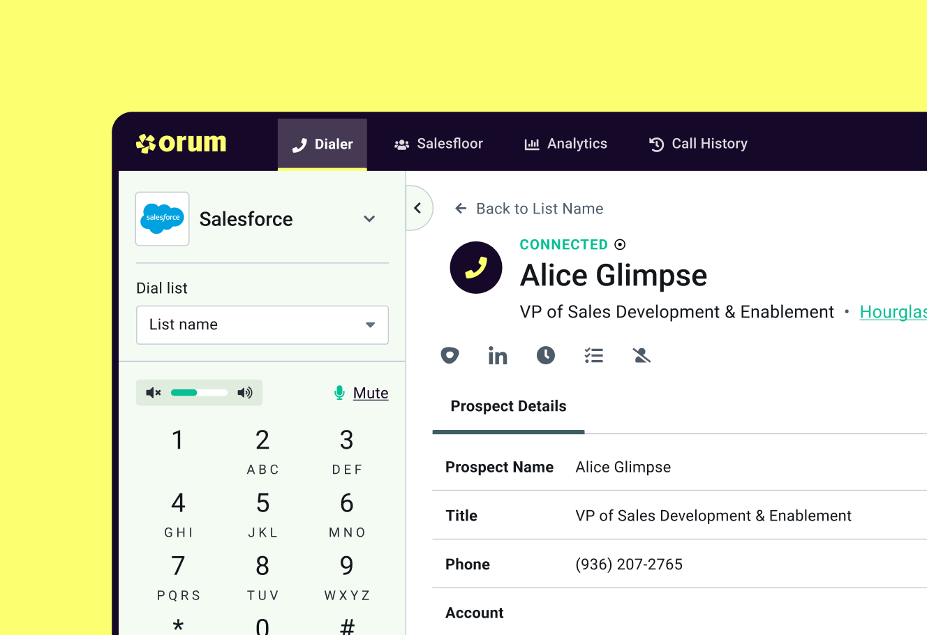
Iconography. Sharp and angular utility icons do the heavy lifting in Orum’s marketing materials, demonstrating abstracted product interfaces and product features.

Graphic language. A range of visual devices underpinned and characterised by a 15 degree forward angle, which just happens to be the optimal body position for a runner.

Photography. Warm and vibrant tone help portray an optimistic outlook and capture themes of human progress and success.
Ready, site, go.
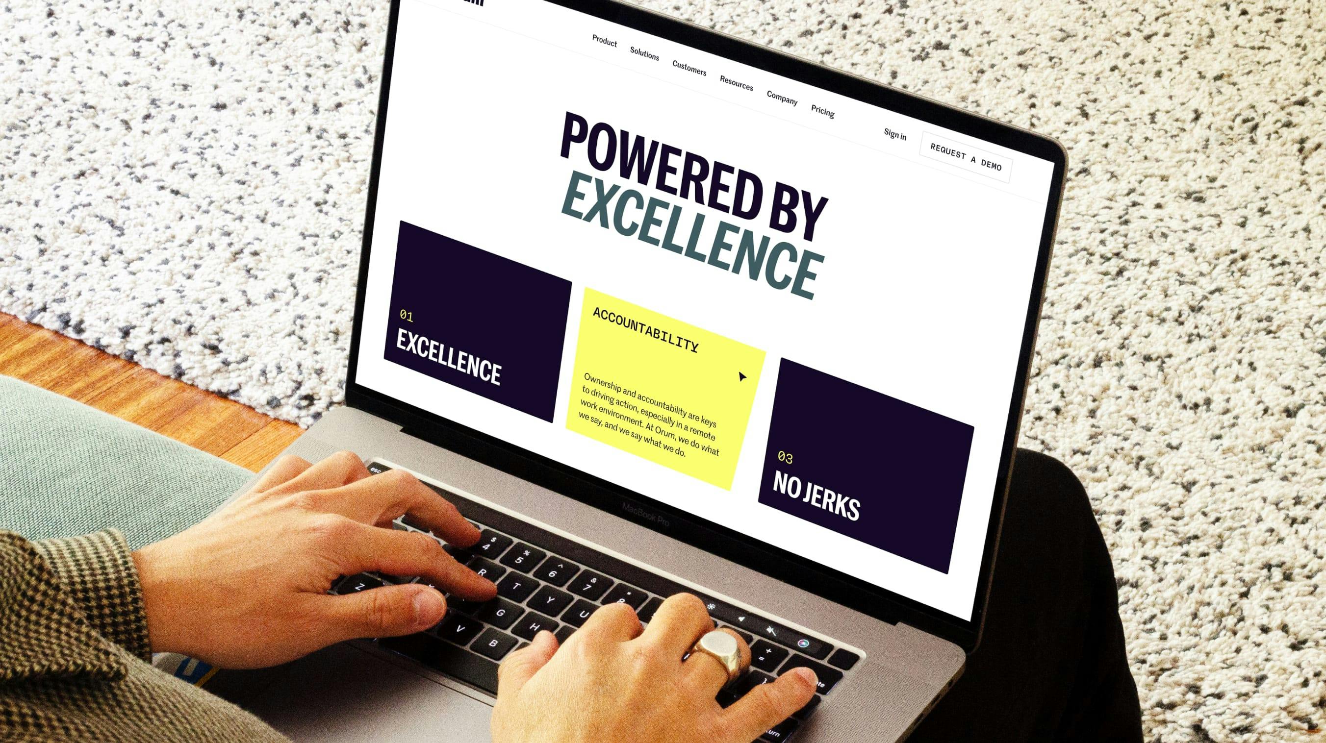
Orum’s new marketing website tells the story of a powerful performance-boosting tool underpinned by leading-edge technology, with the Platform Overview page as a flagship of the experience. Sharp, forward-facing angles paired with subtle motion effects create a sense of momentum in the design that reflects the brand's core creative concept. The need for speed made Next.js an obvious choice for a framework, with Sanity as a headless CMS on top.